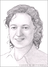
Deborah Adler
The standard, yellowish-colored, round plastic pill bottle has been a familiar fixture in the typical American's medicine cabinet for decades. The bottles' small print and round surface often makes it tricky to read what their contents are, and when and how the patient should take the pills inside. Nevertheless, people had come to accept the bottles as they were. In fact, since their introduction shortly after World War II, little about them had changed at all, save a child-safety cap added in the 1970s. Graphic designer Deborah Adler had a better idea, however, and she set out as a twenty-something graduate student to, quite literally, break the mold.
Born in 1975, Adler, a Chappaqua, New York native, was the daughter of a doctor and a nurse, but she was more interested in pursuing a career in the visual arts. She attended the University of Vermont, earning a BFA in 1997 and continuing her studies at New York's School of Visual Arts, where she completed an MFA in design in 2002.
When Adler needed to come up with a graduate project, she sought problems with substance and personal meaning, in an effort to spend her time working on something that could truly help people. Naturally, the medical field came to mind. When her grandmother accidentally took heart medication meant for her grandfather, Adler discovered her ideal challenge. She realized that the difficulty many individuals have in reading and understanding what it actually says on the typically small and jumbled labels on pill bottles could put them at risk, even grave danger. Research indicates that in fact, 60 percent of individuals have at one time or another taken medication meant for someone else. There had to be a better way.
Adler began working on "Safe Rx," as her SVA thesis project was titled. She identified a number of problems with traditional pill bottles that needed fixing, including inconsistent labeling among pill bottles from different pharmacies; confusing numbers and date information; oversized branding images for drugstores which can take up too much space on labels; poorly designed color combinations for warning stickers and type; and tiny text on the FDA-required separate information sheets included with each medication. Many times patients would not even bother to read these, and ultimately, they'd throw them away. Adler also began working on a new form factor for the bottle itself, aiming to include a flat surface that would allow for better readability of the information included on the label.

The result of her hard work was a more intuitive pill bottle and information system that includes a redesigned bottle, easy-to-read label, removable information card, color-coded rings, and redesigned warning icons. The system's primary goal is to clearly present important information to the patient, and includes an intuitive label divided into primary and secondary info areas. The primary information includes the name of the drug, purpose, dosage, and how to take it. Secondary information contains expiration, quantity, name, and contact information for the prescribing doctor, drug store info, refill number, and dispensing date.
Adler shopped her basic concepts to pharmaceutical retailers and the FDA, but after Target Stores expressed interest in Safe Rx she began collaborating with designers there to refine the concept. Target patented and retained exclusive rights to the system, now known as Clear Rx, and assembled a team to ready it for mass distribution via its pharmacies nationwide.
Working with designer Klaus Rosburg, who was hired by Target to develop the project, Adler originally worked on a bottle design that looked like a semicircle; later, this shape was rejected for the difficulties it presented in fitting a child-proof cap. Rosberg eventually came up with an upside-down bottle design that has two flat sides and rests upon its cap. Rosberg also helped Adler refine her color-coding concept aimed at making it easier for different family members to keep track of which drug containers were theirs. The pair designed a system that uses six colored rubber rings that slip around the neck of the bottle. The idea is that each family member chooses a single color for all bottles that belong to him/her for easy, at-a-glance identification. The bottles also include an info card tucked behind the label so that it's harder to lose and less tempting to toss out.
Target, which decided to manufacture the bottles in its signature red, rolled out the ClearRx prescription-packaging system on May 1, 2005 in its pharmacies across the country. The system was also displayed at an exhibit at New York's Museum of Modern Art in October of 2005. Adler worked at Milton Glaser for five years before she started her own company, Adler Designs.


